29
OUR BUSINESS
DECORATIVE PAINTS
THE EMOTION OF COLOUR
Marketing decorative paints relies as much on quality as it does on making an emotional connection with
the consumer through an innovative, global approach to marketing.
Jotun’s success in the Decorative Paints segment is built
on quality products, close relationships with dealers and a
coordinated local, regional and global marketing strategy. While
the company does invest in television and print advertising and
has established a strong social media presence in most markets,
these efforts are supported by, and build on, the annual launch
of Jotun Global Colour Trends.
SETTING THE TREND
Global Colour Trends is Jotun’s annual presentation of the latest
trends in colour. Unlike some competing paint manufacturers
who present a “Colour of the Year”, Jotun Global Colour
Trends is made up of a series of complimentary colours. These
are organised into three different schemes that evoke different
moods and emotions to appeal to different target audiences.
In addition, Jotun Global Colour Trends is presented in a way
that helps take the guesswork out of choosing different colour
schemes, making it easier for consumers and designers to select
the scheme that best fits their vision.
Colour schemes are selected after an exhaustive process
involving Jotun colour specialists representing each region in
Jotun’s network. Once each colour is specifically formulated by
Jotun’s in-house Colourant Technology laboratory, samples are
assembled in an attractive brochure, featuring interiors shot by
leading photographers and translated into 15 different brand
and language versions. And to generate maximum publicity,
Jotun Global Colour Trends are presented all over the world.
BUILDING THE BRAND
Since the first launch of Jotun Global Colour Trends in 2013,
Jotun has emerged as a leading international colour trendsetter,
gaining recognition from some of the world’s top architects,
designers and fashion influencers. The 2018 collection
(“Rhythm of Life”), launched in 2017, has been supported
by events in more than 30 countries worldwide, helping to
strengthen Jotun’s brand as an important voice in the world of
interior design.
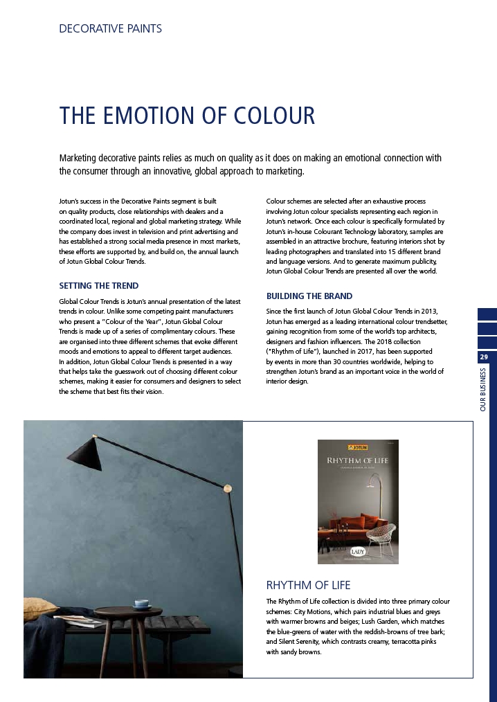
RHYTHM OF LIFE
The Rhythm of Life collection is divided into three primary colour
schemes: City Motions, which pairs industrial blues and greys
with warmer browns and beiges; Lush Garden, which matches
the blue-greens of water with the reddish-browns of tree bark;
and Silent Serenity, which contrasts creamy, terracotta pinks
with sandy browns.